GUIDES · INTERIOR DESIGN STYLES · OCTOBER 2026
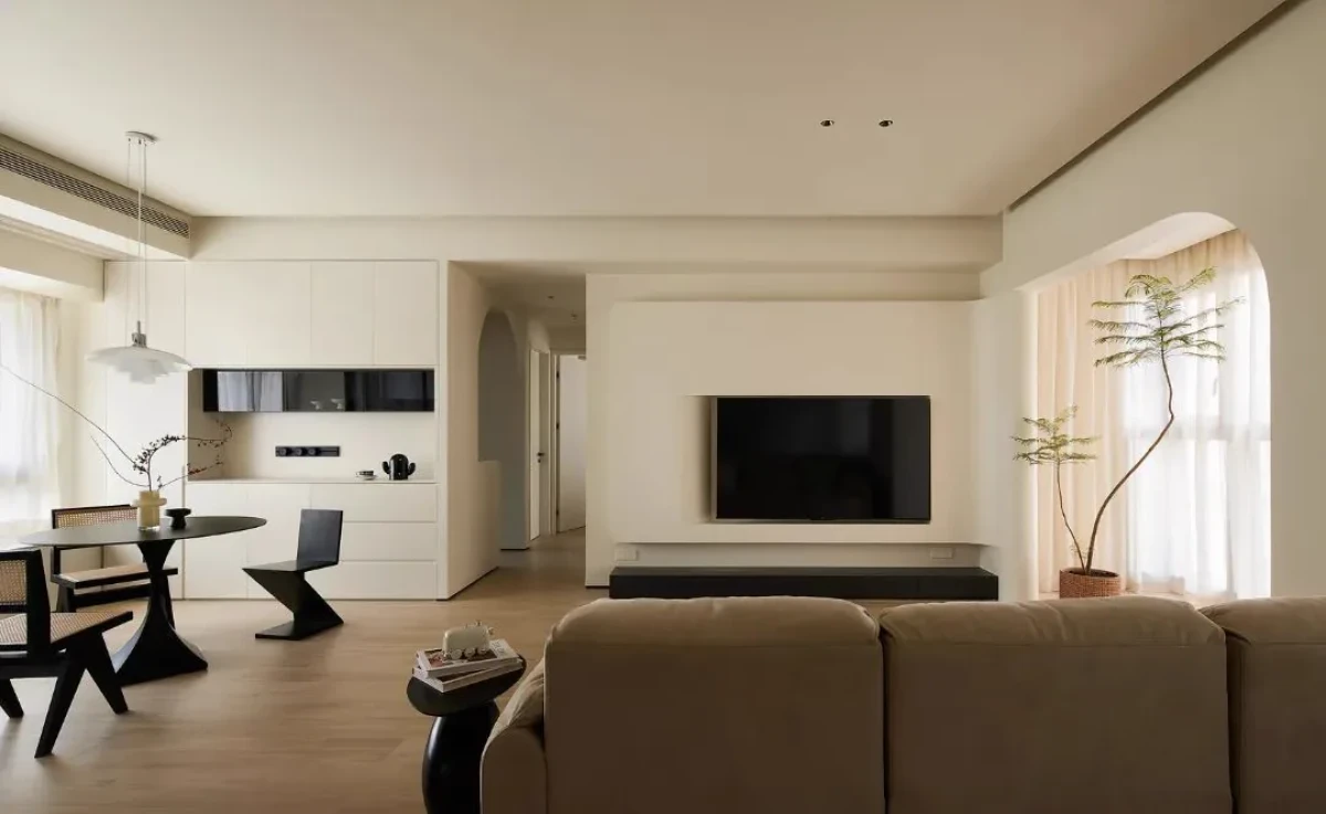
奶油风最好认,也最容易做错。暖白墙面、米色沙发和一道拱门,足以让照片有七八分相似;真正走进房间,差别却很快显出来。有的空间柔和而有层次,有的只是所有界面都罩着同一种米黄色。
Cream style is easy to recognise—and just as easy to get wrong. Warm-white walls, a beige sofa and an arch may make a photograph look convincing, yet the difference becomes obvious in person. One room feels soft and layered; another simply covers every surface in the same yellow-beige cast.
真正的难点不是找到一个“奶油色”,而是在低饱和、低对比的条件下,仍然处理好比例、明度、材料和光线。颜色负责第一眼,空间能不能成立,要看它有没有骨架。
The challenge is not finding a single “cream” colour. It is maintaining proportion, tonal depth, material distinction and purposeful light within a low-saturation, low-contrast palette. Colour shapes the first impression; structure determines whether the room holds together.
为什么奶油风容易变成滤镜Why Cream Style Can Become a Filter
高饱和颜色和醒目装饰很容易制造焦点。奶油风主动放弃这些捷径,墙面分割、柜体厚度、门洞尺度,以及沙发和茶几的距离,反而更容易暴露。平面和比例没有解决好,米白色只会让问题暂时不那么刺眼。
Saturated colour and conspicuous decoration can create an instant focal point. Cream style gives up those shortcuts, exposing wall divisions, cabinet depth, doorway proportions and the distance between sofa and table. If the plan and proportions are unresolved, off-white merely makes the problem less obvious.
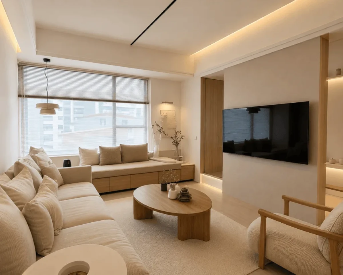
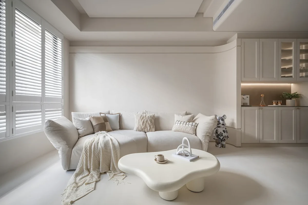
最常见的误解,是把“柔和”当成“消除差异”:墙、地面、柜体和家具靠近同一种米色,表面也统一成细腻哑光。照片整齐,现场却没有前后、轻重和触感。耐看的做法不是拒绝对比,而是把对比压低,并让少量深色出现在能够稳定画面的位置。
The most common mistake is to equate softness with the removal of difference. Walls, floors, cabinetry and furniture converge on one beige tone, while every surface shares the same fine matte finish. The photograph looks tidy, but the room loses depth, weight and tactility. Successful cream interiors do not eliminate contrast; they lower it and place a few darker notes where the composition needs stability.
先把概念说清楚Defining the Term
“奶油风”是中文家居与室内设计市场近年形成的通俗标签,并非拥有明确发源时间、代表人物和理论宣言的历史流派。英文中的 Cream Style、Creamy Interior 或 Cream-toned Interior,通常只是描述色调和氛围,不能与现代主义、装饰艺术等设计史概念并列。
“Cream style” is a popular label that emerged in the Chinese home and interiors market rather than a historical movement with a defined origin, leading figures or manifesto. English phrases such as Cream Style, Creamy Interior and Cream-toned Interior usually describe palette and atmosphere; they are not equivalent to established design-history terms such as Modernism or Art Deco.
它与暖调极简、柔和极简和部分当代住宅设计有所交集,常见暖白、燕麦、米杏和浅木色,也偏爱低对比、漫射光、织物与哑光表面。但这些不是固定清单。更重要的是:浅色之间是否有层级,材料靠近后是否仍有差异,夜晚是否保留暗部,日常用品进入后是否仍然好用。
It overlaps with warm minimalism, soft minimalism and some contemporary residential design. Warm white, oatmeal, pale apricot and light timber are common, as are subdued contrast, diffuse light, textiles and matte surfaces. None is compulsory. More useful questions are whether pale tones remain legible, nearby materials still feel distinct, the night-time scene retains shadow, and the room continues to work once everyday objects arrive.
颜色不是色号,而是距离Colour Is a Relationship, Not a Code
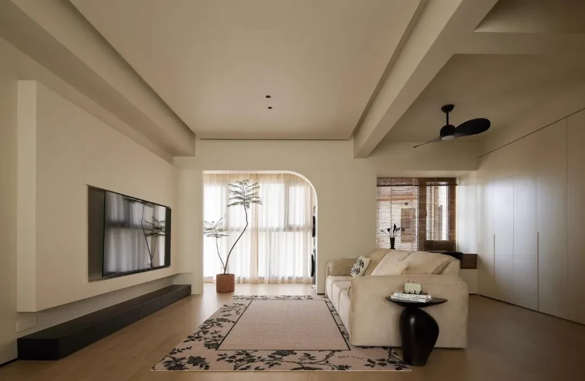
奶油色不是一个固定色号,而是一组彼此接近但不完全相同的颜色。墙面可以偏暖,顶面略干净;柜体与墙面保持轻微明度差,沙发和窗帘再向燕麦、沙色或带灰的米杏移动。第一眼属于同一色域,停留久一点,边界才逐渐显出来。
Cream is not a fixed colour code but a family of tones that sit close together without becoming identical. Walls may be warmer and ceilings slightly cleaner; cabinetry can shift in value, while upholstery and curtains move towards oatmeal, sand or greyed apricot. They read as one palette at first glance, then reveal their boundaries over time.
可以把颜色分成三层:背景色用于墙面、顶面和大面积柜体;过渡色落在地面、窗帘、地毯和主要家具上;锚点色只占很小面积,可以是深木、黑色金属、石材纹理或一件较深的家具。关键不是套用配色比例,而是让物体既有轮廓,又不破坏整体的安静感。
A practical palette has three layers. Background tones belong to walls, ceilings and large cabinetry; transitional tones sit on floors, curtains, rugs and main furniture; anchor tones occupy only a small area—dark timber, blackened metal, veined stone or one deeper piece. The aim is not to follow a formula, but to give objects enough definition without disturbing the room’s calm.
颜色还必须在现场判断。同一块暖白样板,在朝北自然光、傍晚西晒和夜间照明下,可能分别偏灰、偏黄或显得发脏。屏幕色卡只能开始讨论,不能替代真实光线中的样板。
Colour must also be judged on site. The same warm-white sample can appear grey in north light, yellow in late western sun, or muddy under artificial light. A screen swatch can begin the discussion; it cannot replace a sample observed in the room itself.
材料与光线共同决定质感Material and Light Create Texture Together
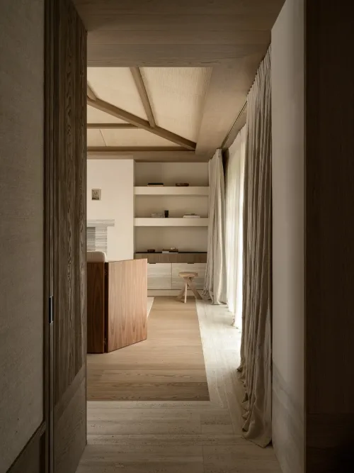
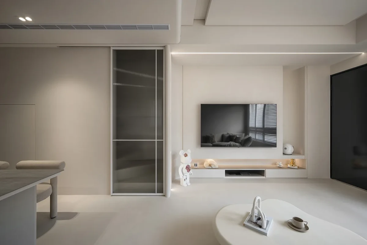
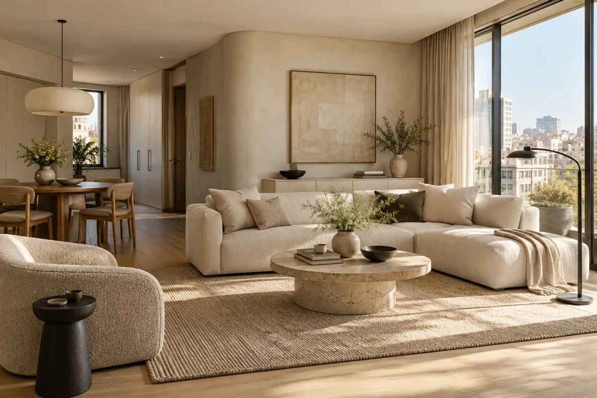
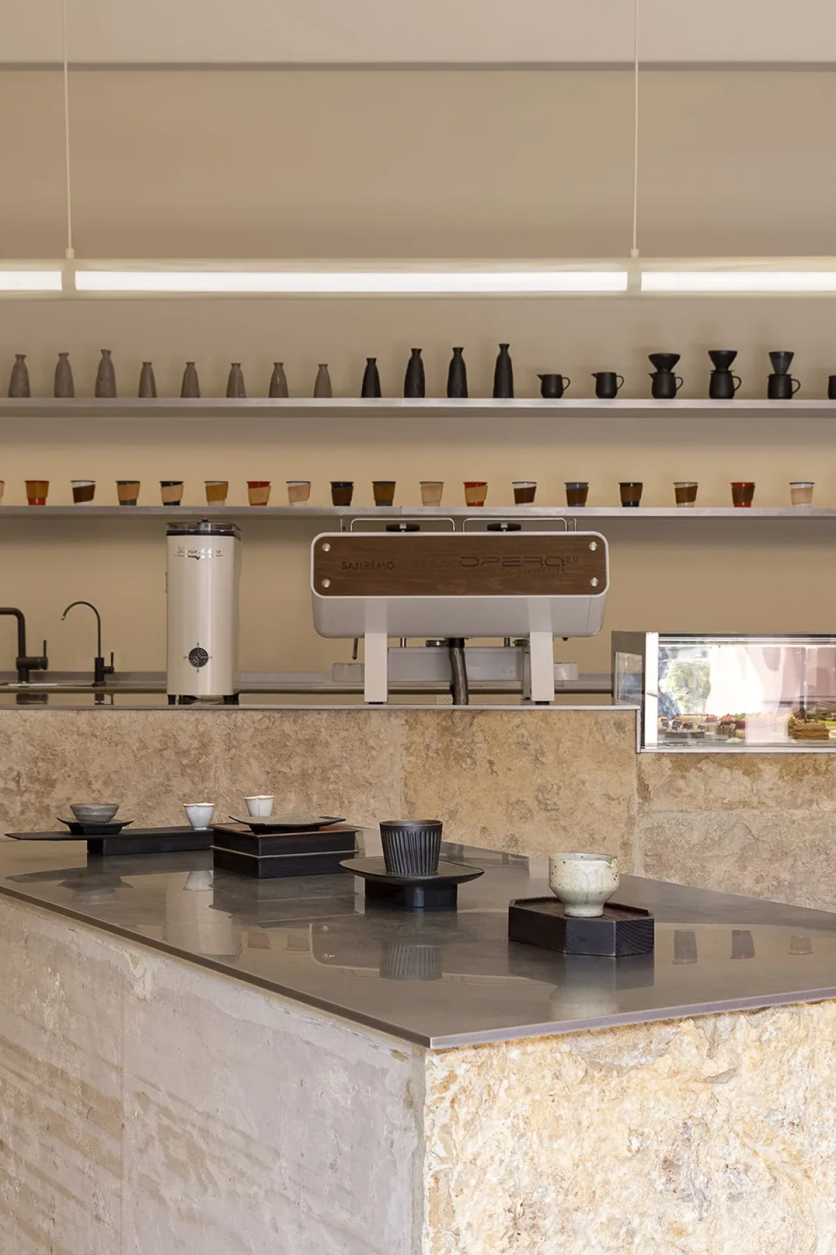
低光泽不等于高级。如果涂料、柜门、地砖和家具都呈现相似的细腻表面,空间仍会像一张没有景深的背景板。更有效的做法,是让近似颜色对光产生不同反应:灰泥留下细小阴影,木纹给出方向,亚麻和羊毛吸收光线,石材、陶釉和少量金属则提供局部反射。
Low sheen does not automatically create refinement. If paint, cabinet fronts, tiles and furniture all share the same smooth matte finish, the room still resembles a backdrop without depth. A better approach is to let similar colours respond differently to light: plaster catches fine shadows, timber introduces direction, linen and wool absorb light, while stone, glaze and small amounts of metal provide controlled reflection.
材料必须回到使用位置。粗糙墙面不适合频繁触碰的通道,浅色圈绒需要考虑清洁,天然石和微水泥也有各自的施工与维护条件。与其不断增加品类,不如明确分工:墙面负责包裹,木材负责温度,织物负责吸音与亲近感,石材负责重量,少量玻璃或金属让光线醒过来。
Materials must also suit their location. A rough wall finish is uncomfortable in a frequently touched passage; pale bouclé demands a cleaning strategy; natural stone and microcement bring their own installation and maintenance requirements. Rather than adding more finishes, assign each one a role: walls provide enclosure, timber warmth, textiles softness and acoustic absorption, stone weight, and a little glass or metal visual alertness.
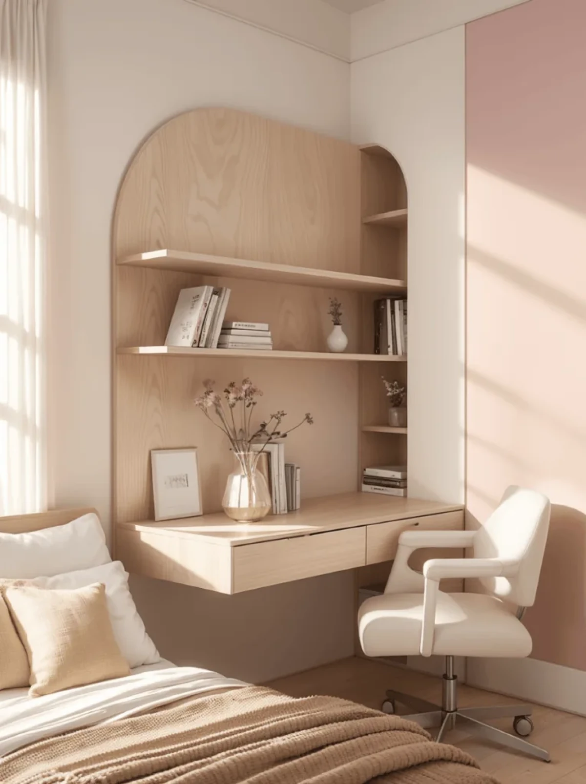
夜晚同样不能只靠“暖色温”。环境光保证基本亮度,阅读、备餐和梳妆需要任务照明,艺术品或肌理墙面可以用少量重点光。台灯、落地灯和餐桌吊灯把光源降到人的活动高度;保留下来的阴影,则确认家具体量和房间深度。
At night, warm colour temperature alone is not enough. Ambient light provides general visibility; reading, food preparation and grooming require task lighting; art or textured walls may receive a small amount of accent light. Table lamps, floor lamps and pendants lower illumination to the level of daily activity, while retained shadows confirm the weight of furniture and the depth of the room.
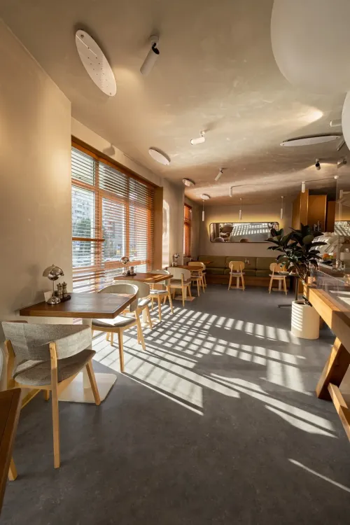
在不同时间观察空间同样重要。上午的冷光、傍晚的暖光和夜间人工光,会改变墙面、木材与织物之间的关系。设计师应把照明场景和材料样板放在一起校验,而不是分别决定。只有当不同光线下的层级都能成立,浅色空间才不会依赖某一个拍摄时刻。
The room should also be observed at different times of day. Cool morning light, warm evening light and artificial light each alter the relationship between walls, timber and textiles. Lighting scenes and material samples should be tested together, not decided separately. A pale interior becomes robust only when its hierarchy survives more than one photogenic moment.
曲线不是必要条件Curves Are Not a Requirement
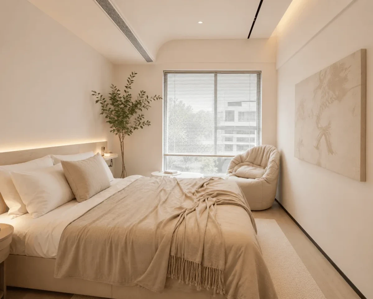
拱形门洞、弧形沙发和圆角茶几已经成为奶油风最容易识别的符号,但没有必要同时出现在每个位置。曲线最好有具体用途:改善转角通行、引导视线、包住座位,或自然连接两个体块。所有边界都变圆,只会让柔和滑向造型堆积。
Arched openings, curved sofas and rounded tables have become the style’s most recognisable signs, but they do not need to appear everywhere. A curve works best when it improves movement, guides the eye, encloses a seat or connects two volumes. Rounding every edge turns softness into formal excess.
家具仍需保持直与曲、轻与重、高与低的变化。体量饱满的沙发可以搭配结构清楚的边几,厚实地毯和窗帘需要一盏纤细灯具或一件深色器物来平衡。奶油风可以柔软,但不能没有骨架。
Furniture still needs variation between straight and curved, light and heavy, high and low. A full-bodied sofa may sit beside a sharply structured table; substantial rugs and curtains benefit from a slender lamp or dark object. Cream style can be soft, but it cannot be shapeless.
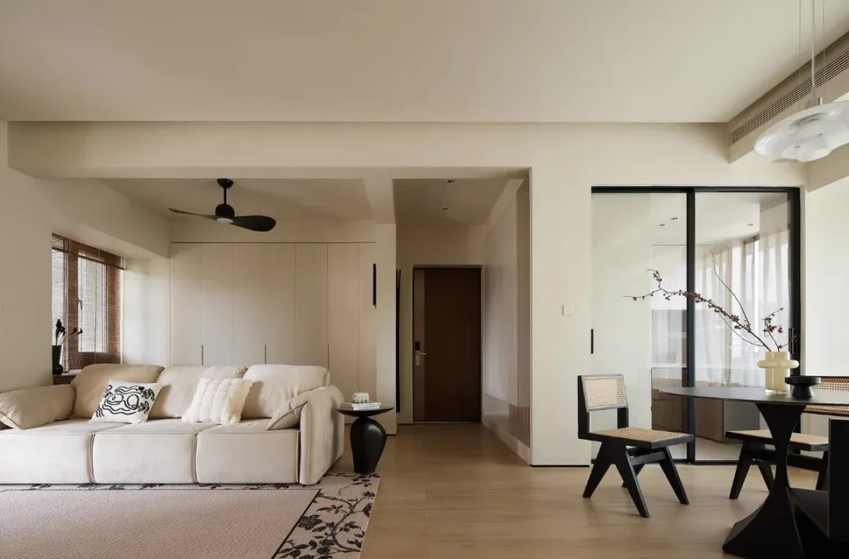
住进去以后,风格才真正开始The Style Begins When Life Moves In
奶油风在样板房里很容易成立,难的是容纳书、儿童用品、绿植、电器和收藏带来的真实颜色。如果空间必须把一切藏起来才能维持风格,它解决的只是拍照问题。
Cream style is easy to stage in a show home. The real test is whether it can absorb the colours of books, children’s belongings, plants, appliances and collections. If everything must be hidden for the room to remain coherent, the design has solved only the photograph.
设计时应先安排高频物品,再决定哪些展示、哪些收纳。开放格集中一两处,比平均铺满整面墙更容易控制密度;封闭柜体也不必完全隐形,适度的分缝和拉手会让它更像可以使用的家具。
Plan for frequently used objects first, then decide what should be displayed and what should be stored. One or two concentrated open shelves are easier to control than a wall of evenly distributed niches. Closed cabinetry need not disappear completely: measured joints and handles can make it read as usable furniture rather than a false wall.
普通家庭最值得借鉴的不是购买一整套“奶油风单品”,而是先做四件事:调整主要家具的距离;拉开墙面、家具与锚点的三层明度;减少无意义的灯带;选择能清洁、能维护、经得起触摸的材料。真实的奶油风不是维持“无物”状态,而是提前为物品预留位置和视觉余量。完成这些,再考虑拱门或艺术涂料也不迟。
For an ordinary home, the most useful lesson is not to buy a complete set of “cream-style” products. Start with four decisions: correct the spacing between major furniture; separate walls, furnishings and anchors into three tonal levels; remove unnecessary strip lighting; and choose materials that can be cleaned, maintained and touched. A real cream interior is not kept permanently empty; it gives possessions a place and leaves enough visual room around them. Arches and decorative plaster can come later.
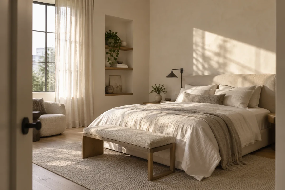
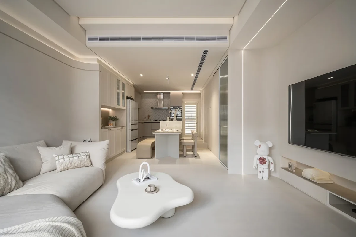
当客户说“我想要奶油风”When a Client Asks for Cream Style
对设计师而言,“奶油风”更像一份感受型需求,而不是完整的设计任务。客户说想要温柔、明亮、干净,背后可能是采光不足、杂物过多、家具尺度失衡,或对强烈颜色的不安。方案开始前,应先确认:他们所说的“暖”来自墙色、木材还是灯光?最想摆脱的是昏暗、凌乱还是过度装饰?家中有哪些不能隐藏的物品?曲线需要解决动线,还是只来自参考图?儿童、宠物、清洁频率和预算允许哪些浅色材料?
For designers, “cream style” is closer to an emotional brief than a complete design programme. A request for something soft, bright and clean may conceal poor daylight, too much clutter, badly scaled furniture or anxiety about stronger colour. Before designing, clarify what “warmth” means—wall colour, timber or light; whether the client is escaping darkness, disorder or excessive decoration; which belongings cannot be hidden; whether curves solve circulation or merely copy a reference image; and which pale materials are realistic for children, pets, cleaning habits and budget.
答案确定后,再做材料板与照明场景。材料板不应只排列颜色,还要标明光泽、纹理方向、触摸频率和清洁方式,并同时在自然光与计划采用的人工光下观察。预算有限时,优先保证家具尺度、照明、高频接触材料和收口质量,通常比增加造型更有效。
Only then should the material board and lighting scenes be developed. The board should record sheen, grain direction, frequency of touch and cleaning method—not colour alone—and be reviewed in both daylight and the proposed artificial light. When budgets are limited, furniture scale, lighting, frequently touched materials and junction quality usually matter more than additional shapes.
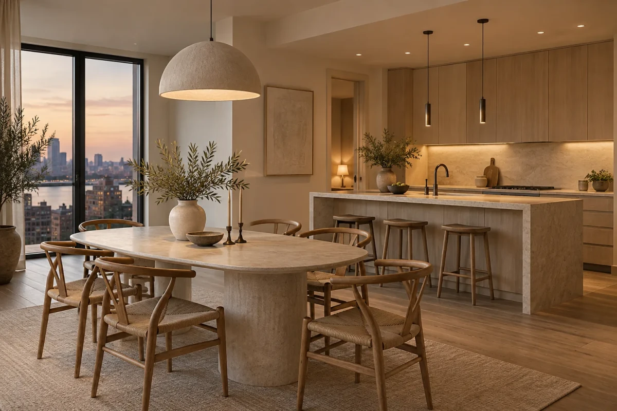
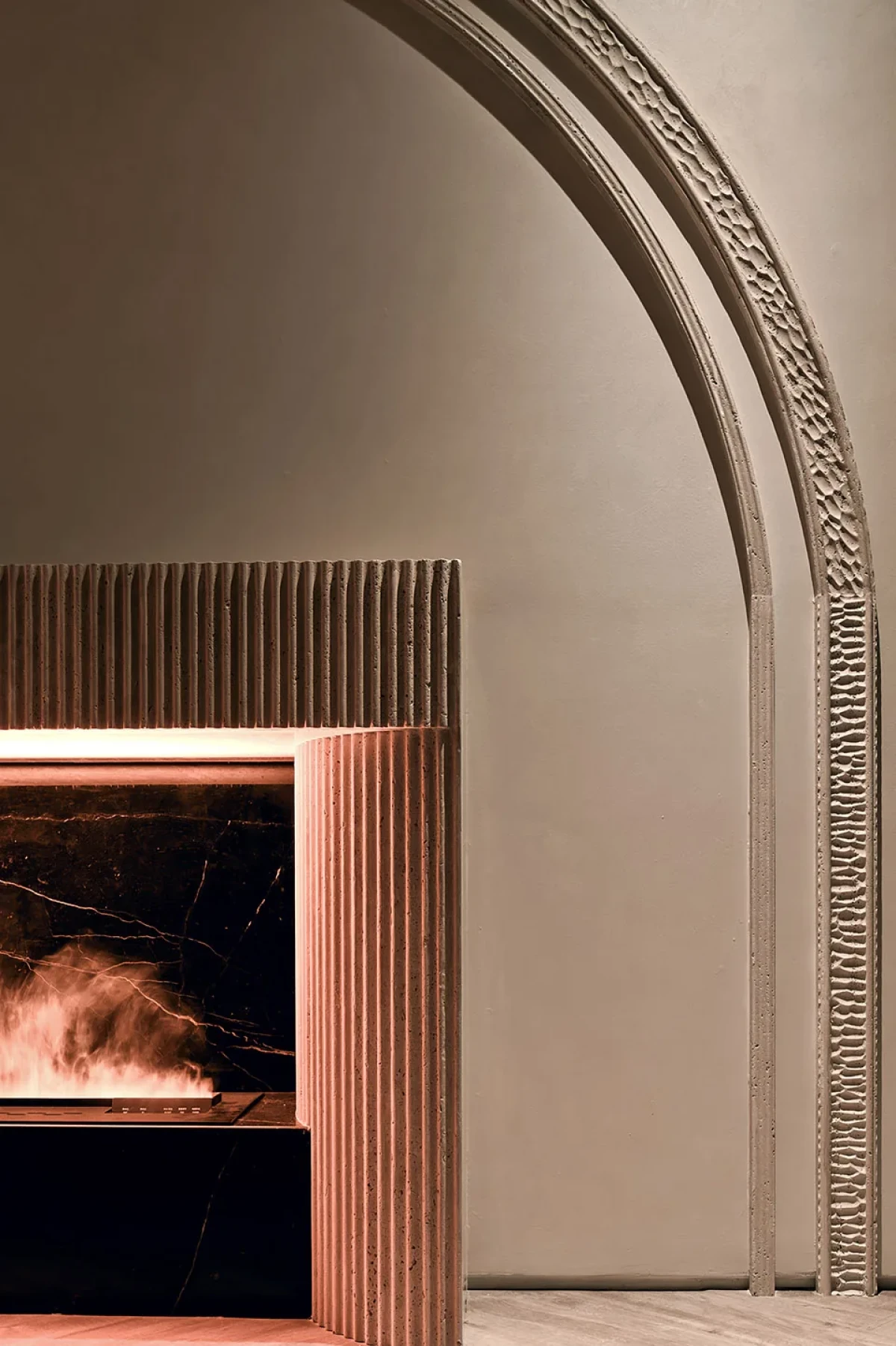
奶油风的价值,不在于复制一套温柔符号,而在于重新看见浅色空间里的细小差别。颜色可以克制,比例不能含糊;材料可以接近,触感不能相同;光线可以柔和,暗部不能被全部抹掉。
The value of cream style lies not in copying a set of gentle symbols, but in noticing the small differences within a pale interior. Colour may be restrained, but proportion cannot be vague; materials may be close, but their tactility cannot be identical; light may be soft, but darkness cannot disappear.